AuraGlow

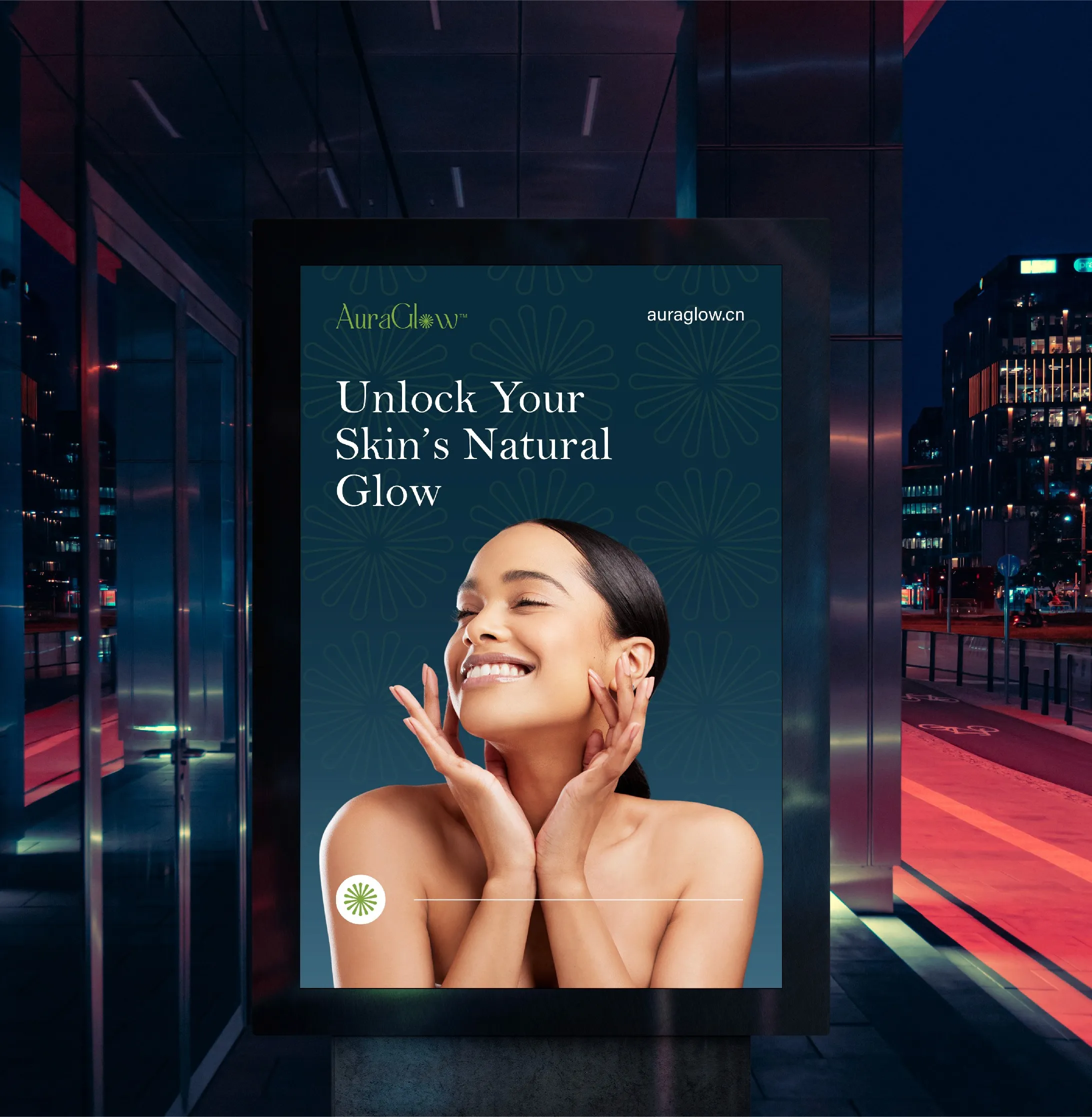
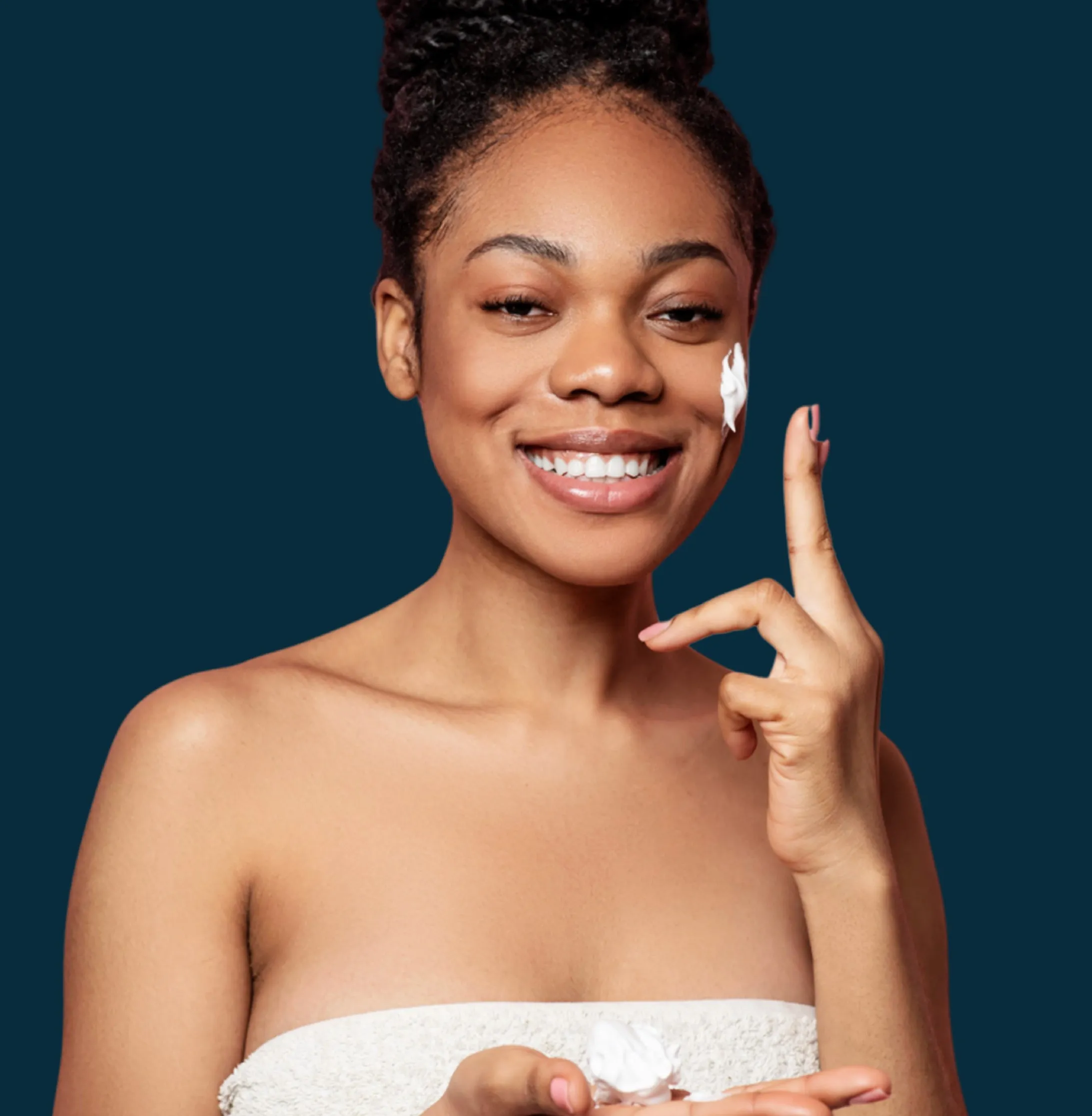
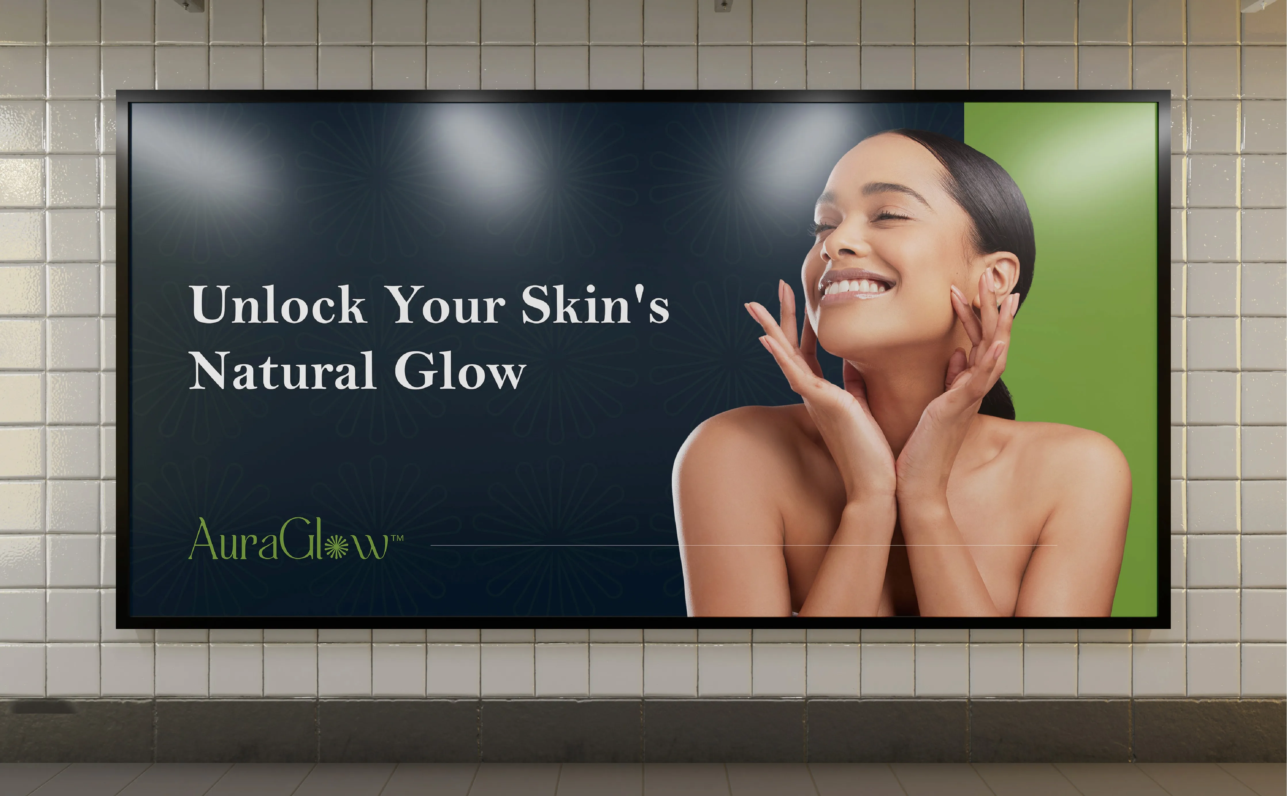
AuraGlow is a natural skincare brand built for women who want clean, effective products without paying premium prices. The brief was clear: the brand had to feel trustworthy and gentle without looking cheap.
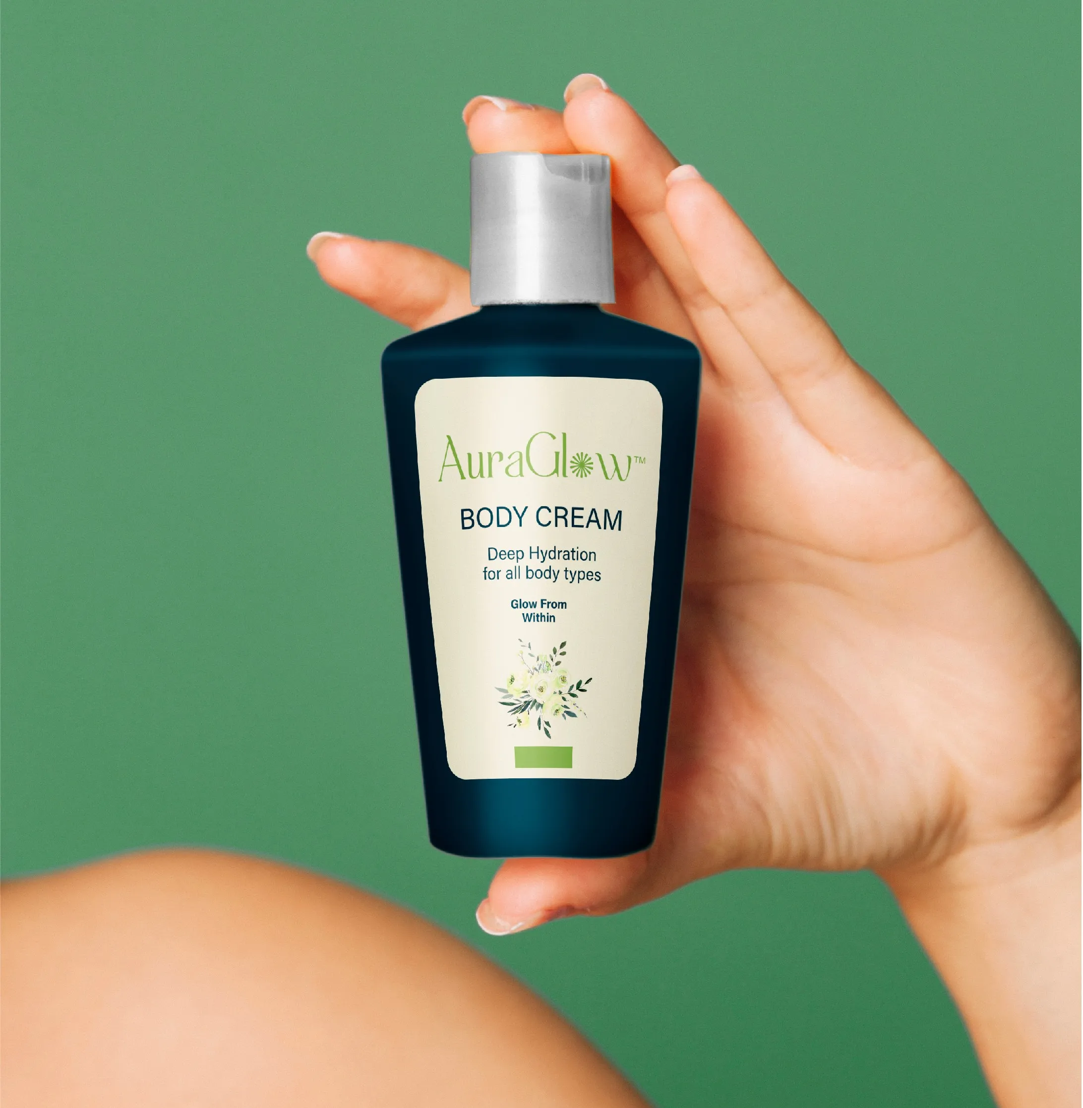
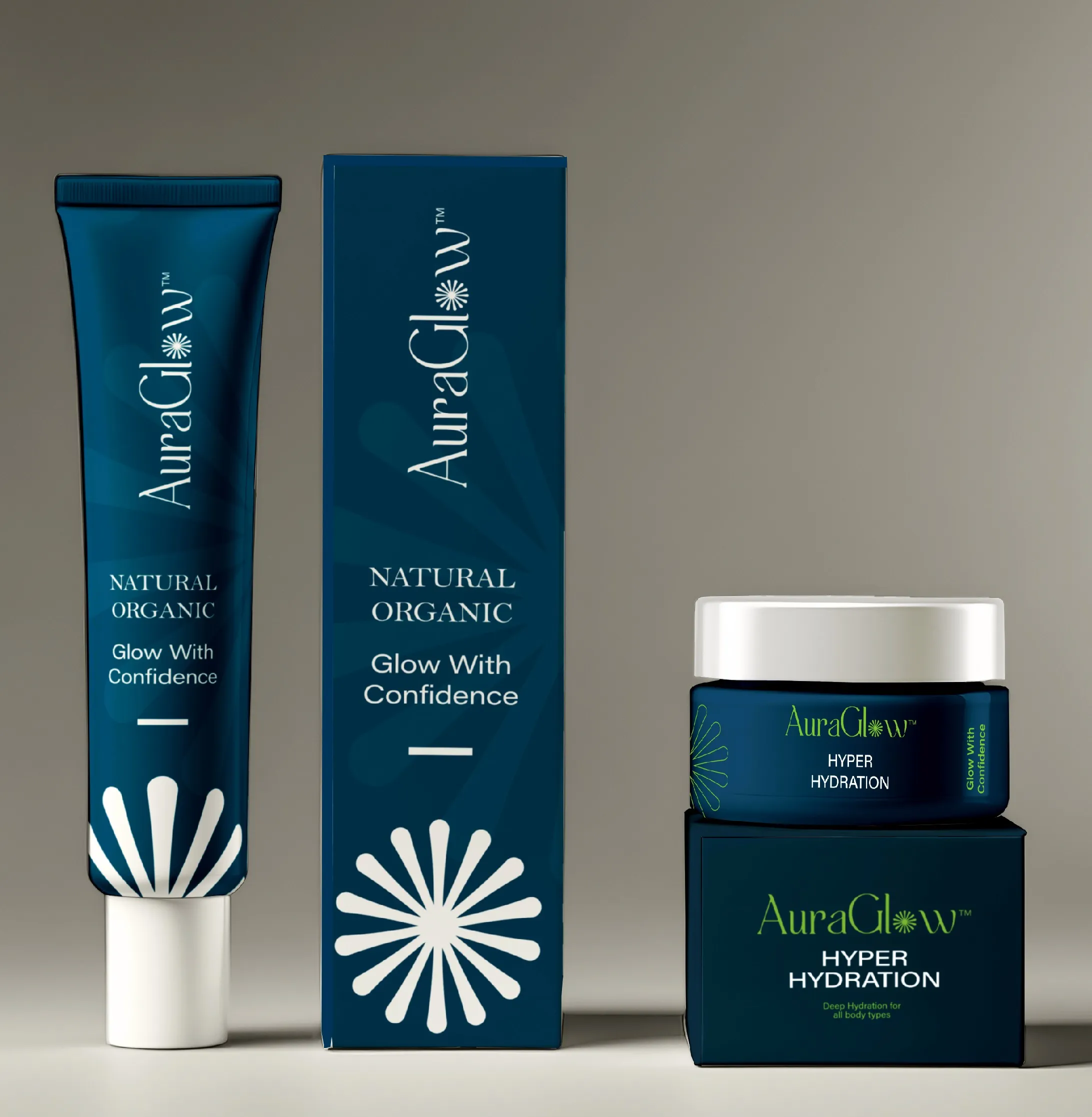
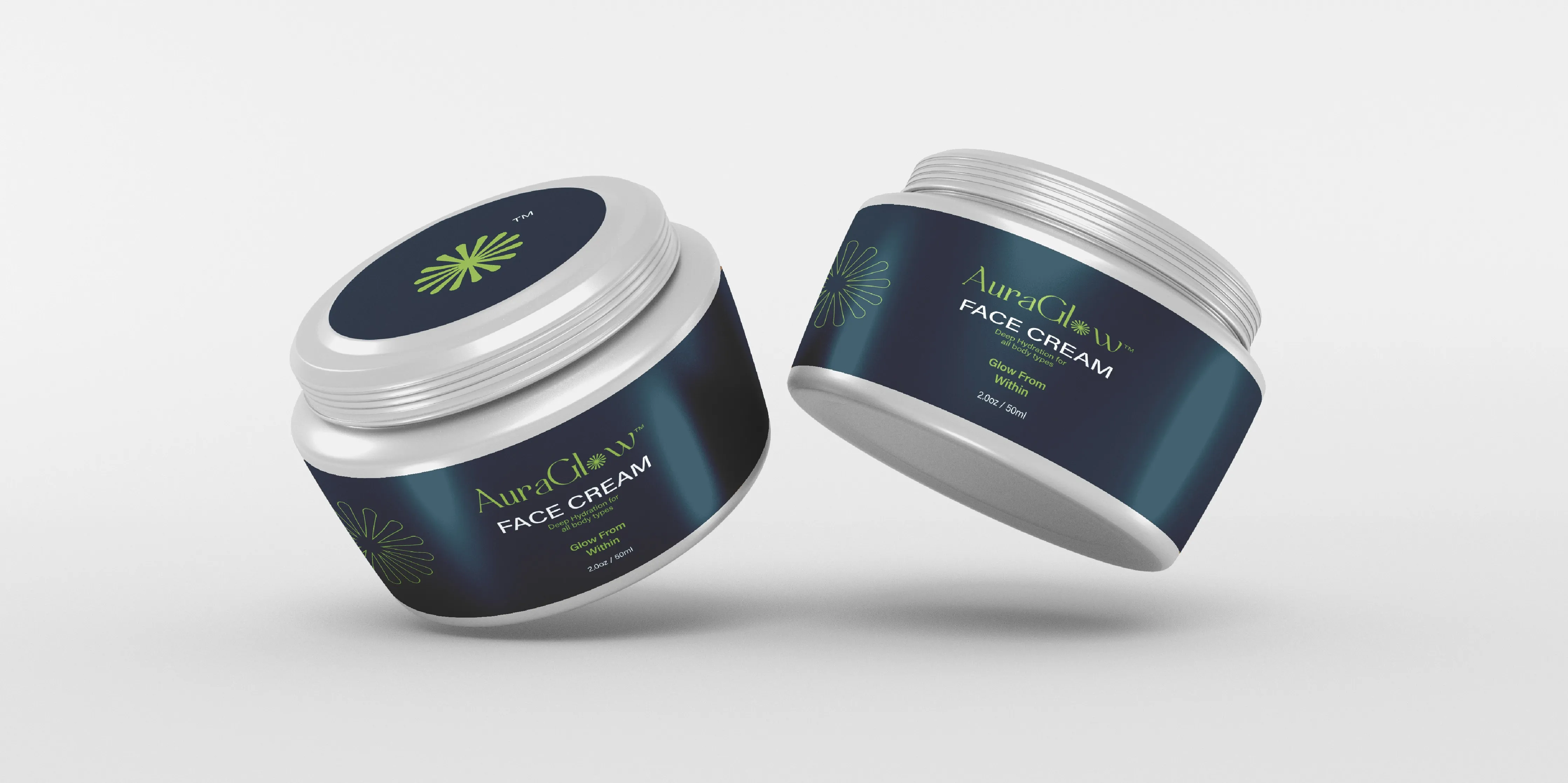
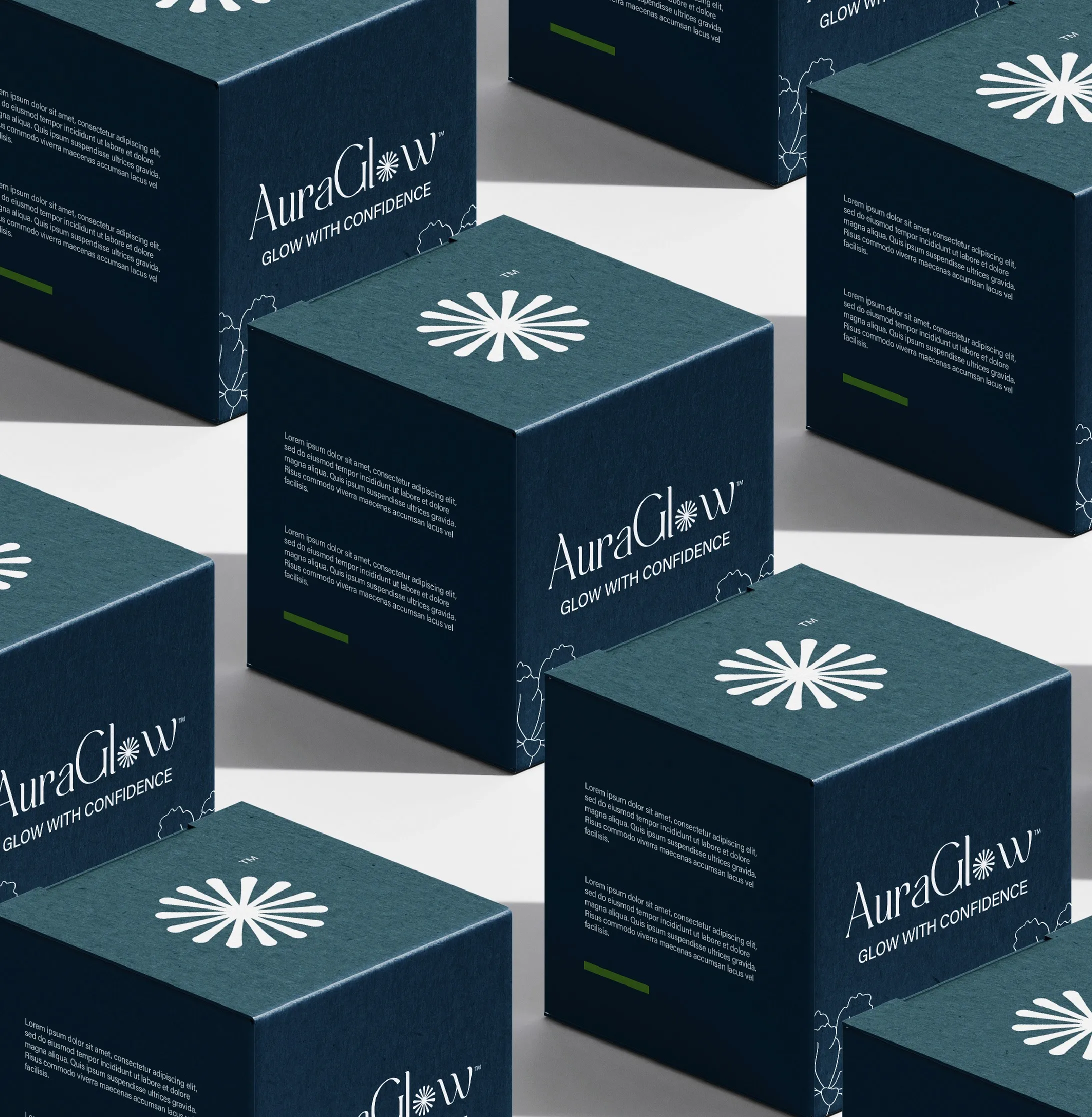
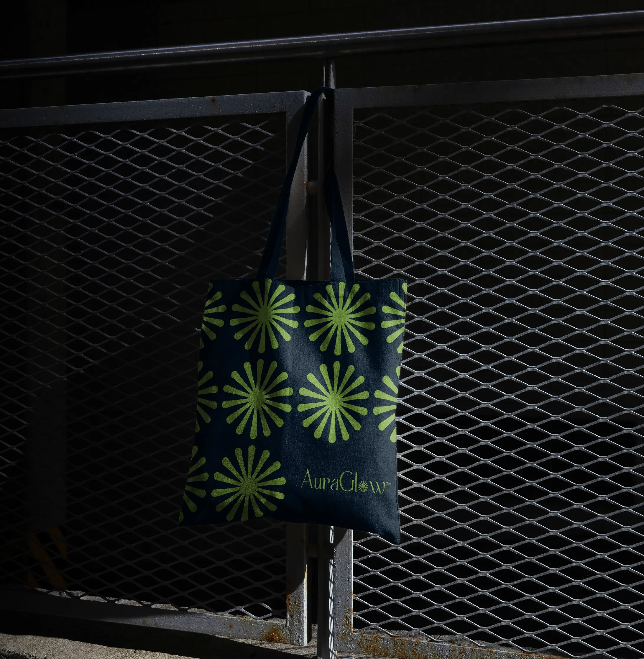
I designed a logo built around two things: a custom serif wordmark that carries the sophistication the brand needed, and a floral icon that replaced the O in Glow to make the brand promise visible in the mark itself.
YEAR:
2024
PROJECT SCOPE:
Logo Design
Brand Identity
Logo Animation
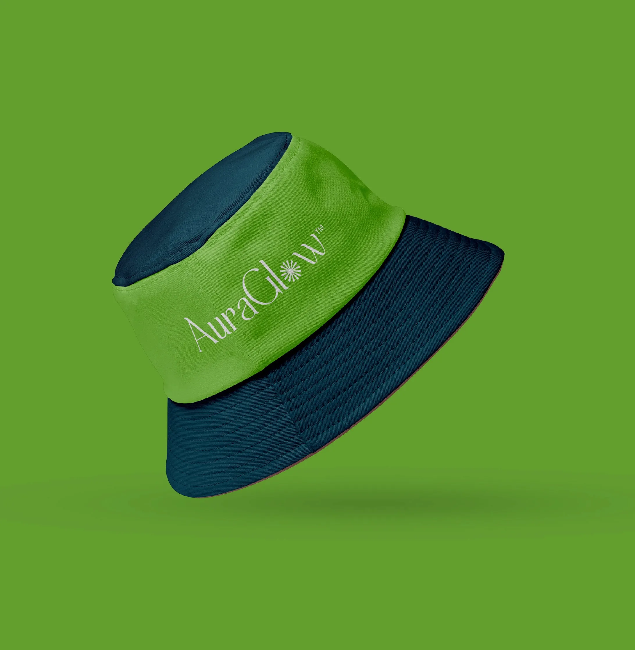
Packaging
ROLE:
Brand Designer
Creative Director
INDUSTRY:
Skincare
Lifestyle
View on Behance ↗
Logo Rationale
I designed the AuraGlow logo around two elements that work together to tell the brand's story: a custom serif wordmark and a stylized flower icon.
I chose a serif font for the elegance and sophistication it carries, the right fit for a premium skincare brand.
The detail I'm most proud of is replacing the "O" in Glow with a floral icon. It does two things at once: it nods to the natural ingredients at the core of the brand, and it literally illustrates the glow the brand promises its customers.
Colors
Deep Ocean
#0A2B3C
Olive Lime
#80A941
Soft White
#F4F4F4


Want something
like this?
Tell me about your brand. I will figure
out what it needs and how to get there.

